Tapping the Sync
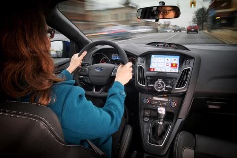
Mark Boyadjis, senior analyst for automotive technology at IHS Automotive, takes a look at the Ford Sync 3 infotainment platform
After the roughly 18 month user-centric development process, which took engineers all over the country – and soon internationally – collecting upwards of 22,000 pieces of direct customer feedback, Ford is ready to show the world what will replace its often criticised Sync with MyFord Touch platform. Ford Sync 3 will debut on model year 2016 vehicles in 2015 and be fully deployed in North America by the end of calendar year 2016.
This speedy rollout is designed to re-introduce quickly and effectively Sync to users all over the world, and do so with a system designed for simplicity, efficiency and usability. While it carries with it some new features over its predecessor, Sync 3 is not going to become a new benchmark for flashy wow factors. This might not win over an Audi owner but, then again, Ford is most interested in taking share from Toyota, Honda and Chevrolet. Those buyers are less impressed with glitzy name-brand chipsets and find more value in something they can understand the minute they take the keys from dealer.
User interface
The most stark contrast is the display, moreover the gui (graphic user interface). Ford has ditched the four corners design, instead putting core functions such as audio, climate, phone and navigation in functional tabs along the bottom of the screen – only disappearing on certain screens, such as map view or rear camera view. Ford also added an apps tab and a settings tab to round out the six large, high-contrast icons that grace the “system tray” as Ford engineers referred to it – a clear reference to the PC world.
Other changes to the wireframe include a maximum of four items per page when scrolling through a list, large tiles with 2D flat black icons, simple text modifiers for secondary menu selections (such as main settings or entertainment sources), and an on-off toggle bar for many settings that looks as if it was taken straight off an IPhone.
Furthermore, Ford has drastically changed up the colour scheme. Engineers opted for a mostly pale blue background on nearly every menu and screen with 3D floating light grey tiles with dark black fonts and 2D black icons. This looks similar in many ways to the new gui for iOS 7, where most menus and functions are black text on white background, versus white text on black background, which MyFord Touch offers. This is the day-mode colour scheme and at night the system reverses to a dark background with white text to reduce driver fatigue.
Between the new gui wireframe and the new colour scheme, it is clear that Ford benchmarked user experience leaders in both the automotive and consumer electronics realm. Tablets and smartphones from all major platforms and manufacturers provided a lot of input for menu structure, colours and icon design, whereas Chrysler’s UConnect system was probably the inspiration for, among other things, the system tray design element which hosts Sync 3’s six primary functions.
Added features
First and foremost, Ford Sync Applink is now finally available on its top-line infotainment system – a feature long missing from MyFord Touch as other OEMs added app after app to their touch screen infotainment platforms. Essentially, this added feature brings Sync 3 into parity with the likes of Toyota Entune, GM MyLink, Chrysler UConnect, Nissan Connect 2 and other OEMs that have already put at least a few apps into their large-screen infotainment platforms. Fortunately for Sync 3 users, because of the vast developer network it already has, they will gain access to more app feeds than any other OEM product on the market today.
A new one-box search allows users to enter addresses, cities and branded or non-branded PoIs into the same, initial search box, eliminating a couple of steps and providing search results on the fly as each character is typed in. Users can also use a similar search function via speech recognition and the natural command structure supplied by Nuance.
Users can search for broad terms such as “Portland”, and the system will bring up results that potentially point to the city in Oregon, a street in Minneapolis or the historic Portland Malt Shoppe in Duluth, Minnesota. Telenav, the navigation engine supplier, powers the contextual filters which provide results based on the command and the popular results based on the driver’s location or search history – all in the interest of reducing the time and attention required to input a destination.
There was hope that this one-box search function would offer results from a connected search, possibly from Google or Yelp, but at this juncture it does not. Another – somewhat minor – letdown was that this search function was not omnipresent. A single search function for anything from a radio station or a phone contact to an album or a coffee shop would provide the user a single starting point for just about any interaction with the system – something already seen on our smartphones.
Speaking of smartphones, Sync 3 will also come with Siri Eyes Free. Users need only to long-press the speech recognition button on the steering wheel, and then the standard Siri Eyes Free functionality is available. When asked about Apple Carplay or Android Auto, both engineering and PR members of the Ford team were very neutral in saying that both were “on the roadmap” but that Sync 3 would not include either of them at launch. While Siri Eyes Free is a nice added feature, it is doubtful many consumers will be satisfied with it, knowing what Carplay is capable of.
In addition, Sync 3 has Wifi enabled sota (software over-the-air) updates that harness the Texas Instruments Wilink connectivity chipset. Instead of mailing out hundreds of thousands of USB drives in shiny blue bubble envelopes to Sync 3 owners worldwide, Ford will now enable anything from a minor software patch to a complete operating-system upgrade to be pushed to owners’ vehicles throughout the life of the vehicle using nothing more than a home Wifi network. This allows Ford to maintain the experience of Sync 3 owners over time without charging them, and requires only minor authentications from end users.
Ford will also enable map updates from its partner Here to be sent via the Wifi OTA platform. However, these are not expected to be free, and will not be available at the launch of Sync 3 in 2015.
Conclusion
It is clear that this time around, Ford has put in the time and listened to enough customers to design, test, debug and finalise this infotainment platform properly before it hits the market. According to a couple of product managers, Ford is aiming to have a 60% penetration for Sync 3 among new car sales in North America by the time the rollout plan is complete. This plan is ambitious, but possible because Ford did not reinvent the wheel with Sync 3.
In this short initial experience with the system it appears much more responsive to inputs and in processing commands. It is clearly more intuitive to learn and use immediately. Also, it has added a few specific features that enhance and improve areas of entertainment, user interface and safety to help keep this platform viable and relevant through the end of the decade, and beyond.
Ford’s next challenge is to get this into production, execute on the plan it has devised, and possibly retake some top spots in terms of customer acceptance and satisfaction – not a cake walk for a car maker that is expected to sell almost seven million cars globally in 2015.
Mark Boyadjis is senior analyst for automotive technology at IHS Automotive.